
Why Data Visualization Matters
Humans process visual information far faster than raw numbers. A well-designed chart lets people spot trends, comparisons, and outliers almost instantly, while the same insight buried in a spreadsheet might take minutes to notice, if it's noticed at all. Good visualization isn't about making data look nice — it's about making data understood.
Choosing the Right Chart Type for Your Data
Different types of data call for different visual approaches:
| Chart Type | Best For | Avoid When |
| Bar Chart | Comparing categories | Showing trends over time |
| Line Chart | Showing trends over time | Comparing unrelated categories |
| Pie Chart | Showing simple proportions of a whole | More than 5–6 categories exist |
| Scatter Plot | Showing relationships between two variables | Categorical, non-numeric data |
| Heatmap | Showing intensity or density patterns | Small, simple datasets |
Core Principles of Effective Data Visualization
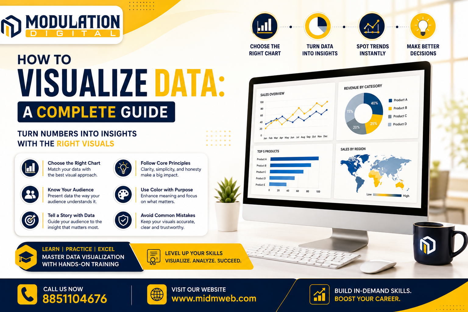
Regardless of the tool used, a few core principles consistently separate clear visuals from confusing ones:
- Start with the question you're answering — choose a chart type based on what you need to communicate, not what looks impressive
- Reduce clutter — remove unnecessary gridlines, colors, or labels that don't add real value
- Use color with purpose — color should highlight meaning, not just decorate the chart
- Label clearly — axis titles and legends should never leave viewers guessing what they're looking at
- Keep scale honest — misleading axis scales can distort how data is perceived, even unintentionally
Presenting Data for Different Audiences
The same dataset often needs to be presented differently depending on who's viewing it:
- Executives — usually need high-level summaries with a clear takeaway, not granular detail
- Analysts and technical teams — often benefit from more detailed, interactive visualizations for deeper exploration
- General audiences or clients — need simple, clean visuals with minimal jargon and clear context
Color Theory Basics for Data Visualization
Color choices can significantly affect how a chart is interpreted:
- Use consistent colors for the same category across multiple charts to avoid confusion
- Avoid red-green combinations where possible, since they're difficult for colorblind viewers to distinguish
- Use a single strong color to highlight the most important data point, keeping everything else more neutral
- Limit your palette — too many colors can make a chart harder to read rather than more informative
Common Data Visualization Mistakes to Avoid
| Mistake | Why It's a Problem |
| Using 3D charts unnecessarily | Distorts proportions and makes accurate comparison harder |
| Starting bar charts at a non-zero baseline | Exaggerates differences and misleads viewers |
| Overcrowding a single visual | Makes it harder to identify the actual key insight |
| Choosing chart type based on preference, not data | Leads to visuals that look nice but communicate poorly |
Storytelling with Data — Going Beyond Just Charts
Strong data visualization isn't just about individual charts — it's about guiding viewers through a logical narrative. This often means ordering visuals so they build toward a conclusion, adding brief context or annotations where needed, and highlighting the specific insight that matters most rather than presenting every possible data point at once. The goal is helping someone understand the "so what," not just the "what."
Tools Commonly Used for Data Visualization
While principles remain the same across tools, a few platforms are widely used in practice:
- Excel — accessible and familiar for basic charts and quick analysis
- Power BI and Tableau — designed specifically for interactive, business-focused dashboards
- Python libraries (Matplotlib, Seaborn) — offer more customization for programmatic, code-based visualization
- Google Data Studio (Looker Studio) — useful for building shareable, web-based reports
About Modulation Digital
Modulation Digital is a Best Data Science Institute in Delhi built around practical, hands-on learning. Students practice visualizing real datasets throughout their training, applying these principles across multiple tools rather than learning theory in isolation.
Meet Your Trainers
Learning data visualization and broader analytics skills at Modulation Digital means training under three specialists:
| Trainer | Specialization | Experience |
| Shivam | Data Analytics | 5+ years |
| Vishal | Data Science | 14+ years |
| Gulshan | Data Science | 6+ years |
Shivam leads visualization training as part of the core analytics curriculum, helping students apply these principles directly to real business dashboards and reports.
Vishal, with over a decade of industry experience, shows students how visualization connects to broader data science storytelling, including presenting model results clearly.
Gulshan works alongside Vishal, helping students strengthen their practical charting and dashboard-building skills through guided practice.
Frequently Asked Questions (FAQs)
1. What is the most important rule in data visualization? Choosing a chart type based on the question you're answering, rather than personal preference or visual appeal alone.
2. Do I need to learn a specific tool to understand data visualization principles? No, core principles like chart selection and clarity apply regardless of which tool you eventually use.
3. Is a pie chart ever a bad choice? Yes, especially with more than five or six categories, where it becomes difficult to compare slice sizes accurately.
4. Why do bar charts need to start at zero? Starting at a non-zero baseline can exaggerate differences between values, misleading viewers about the actual scale.
5. How much color should a single chart use? Generally as little as necessary — using color purposefully to highlight key information works better than decorating with many colors.
6. Is data visualization only useful for business reporting? No, it's valuable across research, journalism, healthcare, and virtually any field where data needs to be understood quickly.
7. What's the difference between a dashboard and a single chart? A dashboard combines multiple related visuals into one view, while a single chart typically focuses on one specific insight.
8. Can data visualization be misleading even without bad intentions? Yes, poor scale choices or confusing chart types can distort perception even when there's no intent to deceive.
9. Should every chart include a title? Yes, a clear title helps viewers immediately understand what they're looking at without needing extra explanation.
10. Is it better to use one detailed chart or several simple ones? Often several simple, focused charts communicate more clearly than one overcrowded visual trying to show everything at once.
11. Do interactive dashboards need different design principles than static charts? The core principles remain similar, though interactive dashboards should also guide users toward the most useful filters or views.
12. How do I choose between a line chart and a bar chart? Line charts suit trends over time, while bar charts work better for comparing distinct categories at a single point in time.
13. Is data visualization a skill separate from data analysis? They're closely related, but visualization specifically focuses on communicating findings clearly, while analysis focuses on uncovering them.
14. Can good visualization make weak data seem more convincing than it should? It can, which is why understanding these principles matters — recognizing manipulative visuals is as important as creating honest ones.
15. Once I know how to build clear charts and dashboards, how does that connect to managing and updating the website where I might publish these reports? That involves basic content management skills. It's covered in detail in our other guide: What is CMS Development and How Does It Work
Conclusion
Learning how to visualize data effectively comes down to understanding a handful of consistent principles — choosing the right chart, reducing clutter, using color with purpose, and telling a clear story — rather than mastering any single tool alone. These skills apply across Excel, Power BI, Tableau, or any platform you eventually use. If you're ready to learn this properly, Modulation Digital, a trusted Best Data Science Institute in Delhi, offers structured training under experienced mentors across data analytics and data science. Reach out today to book a free counselling session.